Social App
UI/UX Design
Overview
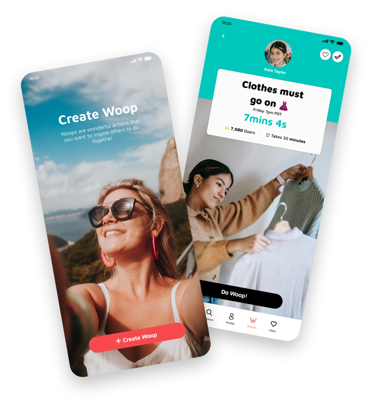
Woopdo is a unique social network where the emphasis is on having fun while doing good in any way, whether alone, with friends or with strangers, mixing digital and real-world ways.
From the start, I was involved in researching and brainstorming ideas for the project, and then helped with creating multiple versions of prototypes. The process was not easy and required a lot of iteration and adjustments along the way, but I feel proud to have been a part of creating something different from the typical social media platform.
Woopdo was a big project and I’m delighted to have been a part of the team that took on the challenge of creating it.
My Role
UX/UI Designer
Collaboration
1 Manager
1 Graphic designer
2 Product designer
1 PR
2 Developers
Platforms
Miro
Figma
Airtable
Asana
Bubble
Reply
Wordpress
Problem
We wanted to develop a different social network where both creators and followers could collaborate in a fun and entertaining way while helping to make the world a better place. From the beginning, we were clear that we did not want a platform where likes and subscriptions predominate, but rather the spirit of having a good time among a group of people with things in common.
Solution
To create a platform where users can:
- Combine social and IRL in a completely new way. Unique one-time experiences. With friends and others online.
- Help people realize the potential, in themselves as well as in others, to do good.
- Provide people with tools that will enable them to identify ways of doing good, take actions and support each other in the process.
User interviews
We interviewed a bunch of social media users, both creators and followers, to have a better understanding of what they needed/wanted and to confirm if our idea could be something they would see themselves using in the near future.
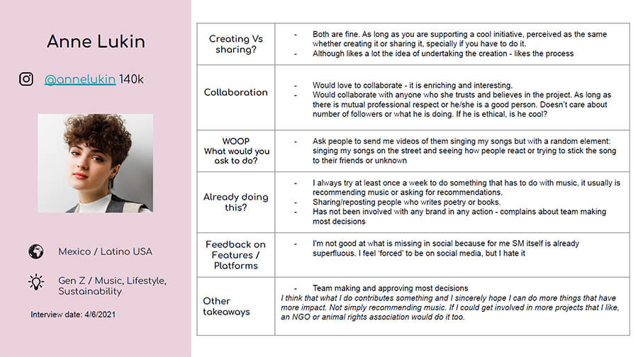
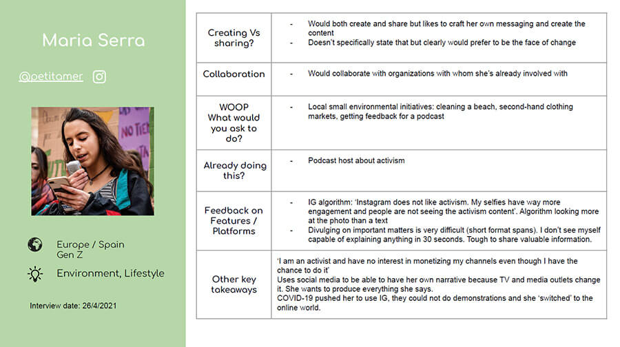
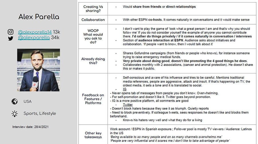
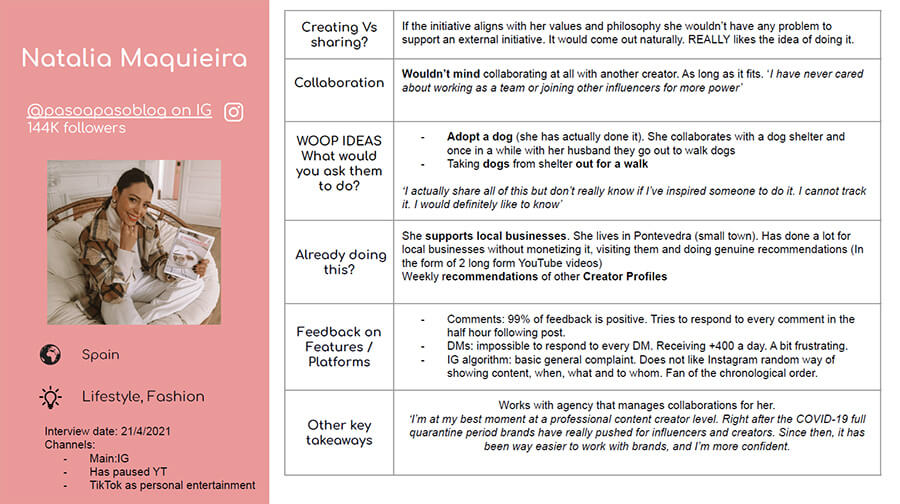
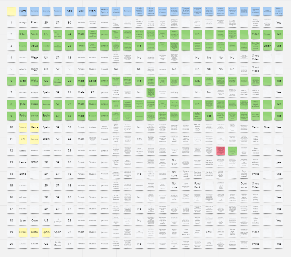
User personas (research)
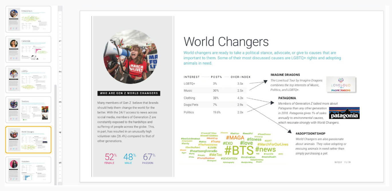
Given the nature of our project, one of our user persona groups was people who were compromised with changing the world (for good). Through secondary research, we were able to identify people from the Gen Z generation as one of our user personas.
Prototypes
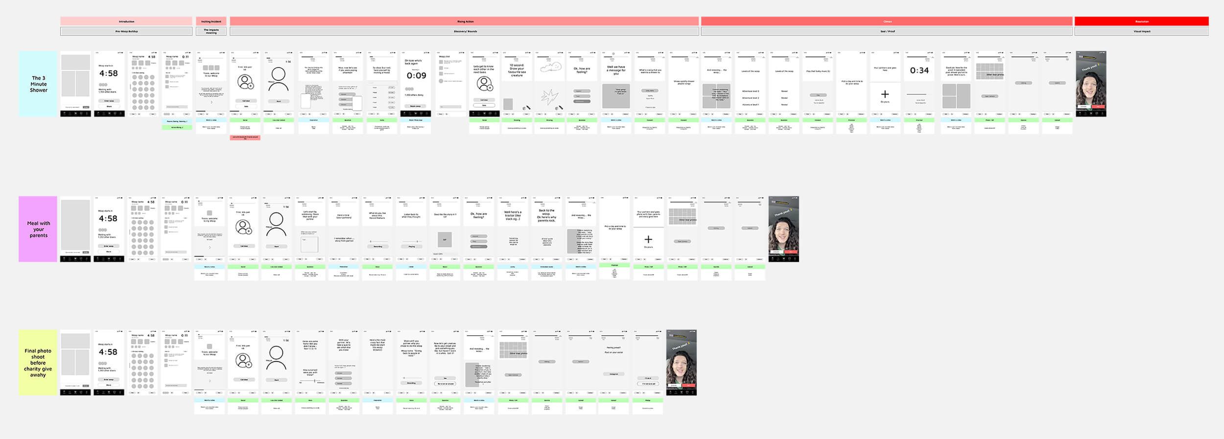
This project had many changes of direction throughout its development. As we progressed with the Empathize stage, we made adjustments to arrive at the final idea. In this process we made different prototypes in low definition that helped us to shape our ideas.
First sketches
User flow
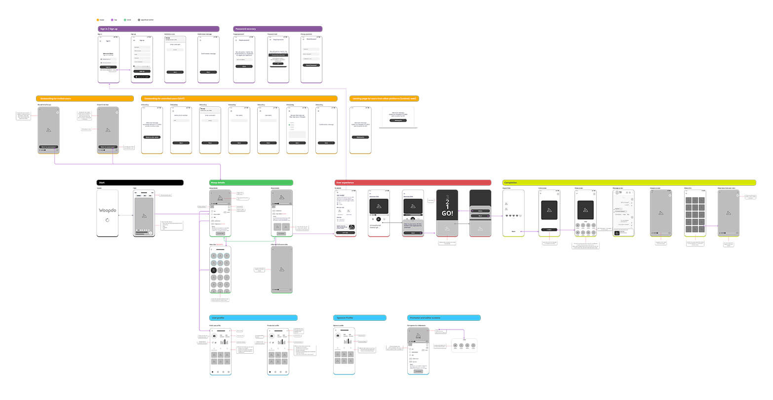
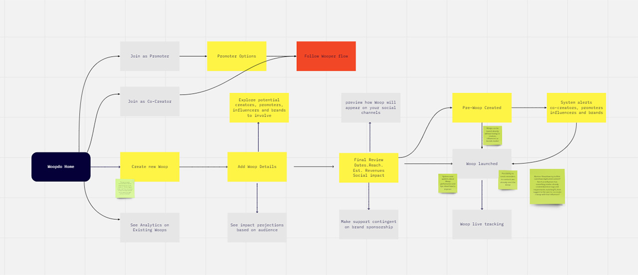
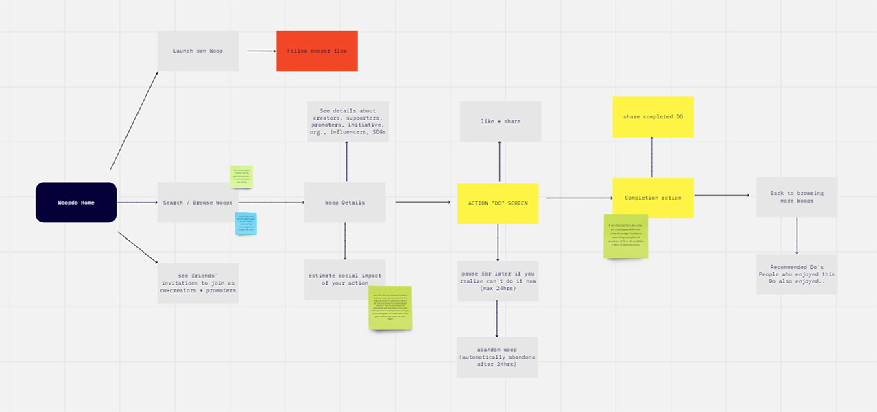
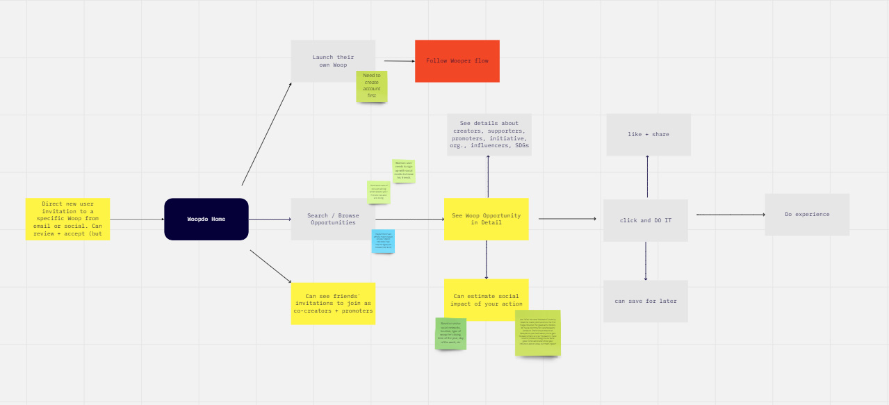
We created three different user flows, one for the creators (woopers), another for the followers (doers), and a third for the visitors.
Wooper flow
Doer flow
Visitor flow
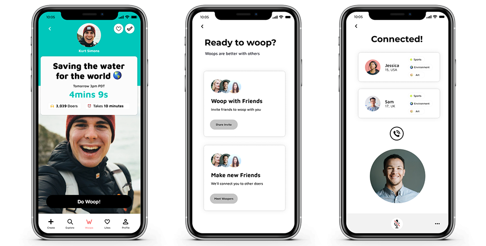
Mockups
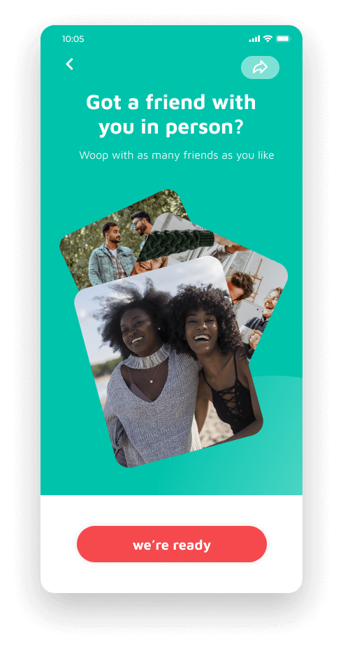
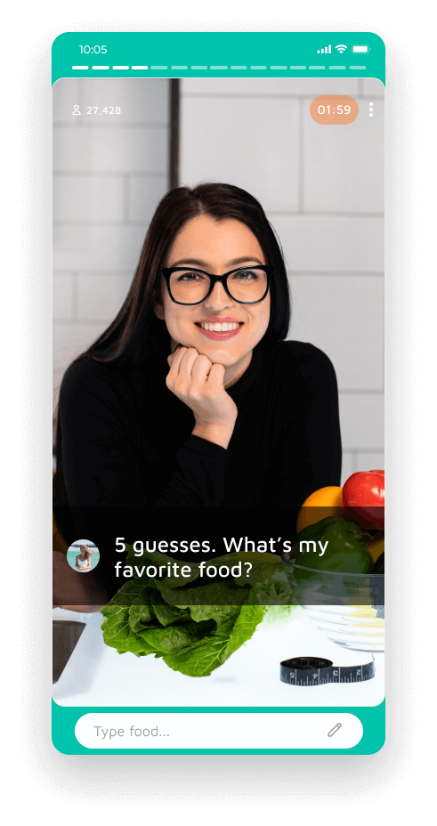
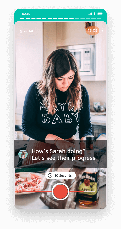
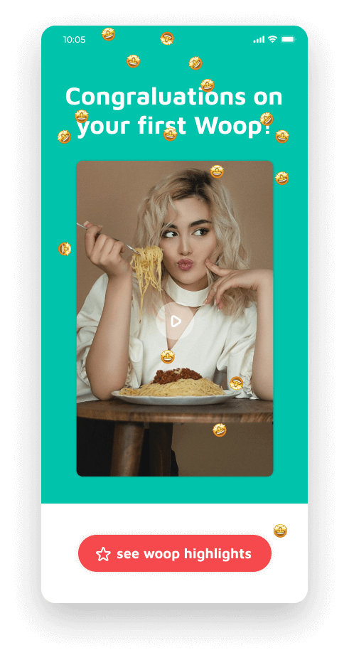
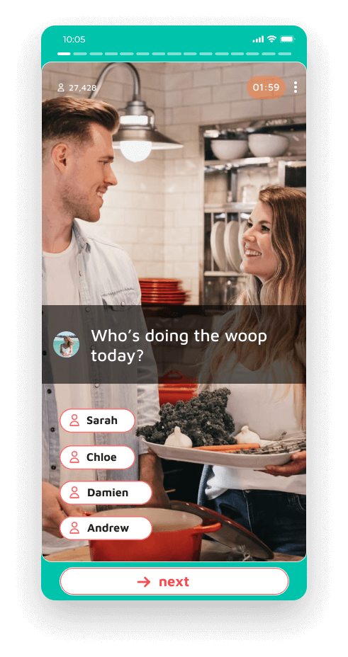
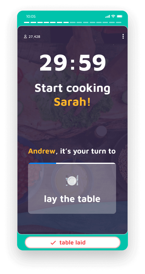
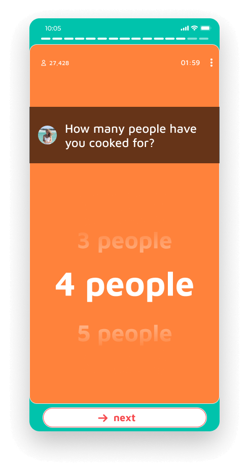
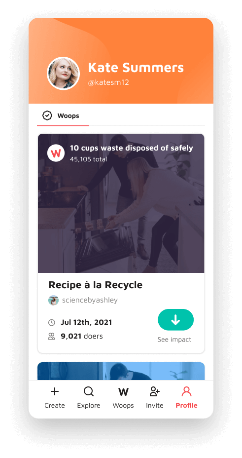
Hi-fi prototypes
What I learned
I learned the importance of iterating and testing to reconfirm that what you are creating is what the user wants and/or needs. This particular project had three major changes in direction and, although it was hard to make those decisions, today I can say that it was worth the effort.
I was lucky to be part of the project from the beginning and to be able to collaborate in most of the decisions that led Woopdo to be what it is (or will be). This allowed me to participate in different tasks such as research, ideation, prototyping, and more.

I have more than a decade of experience as a digital designer. Through the years, I've honed my skills and continuously strive to improve, bringing my best to every project.
