Health App
UI/UX Design
Overview
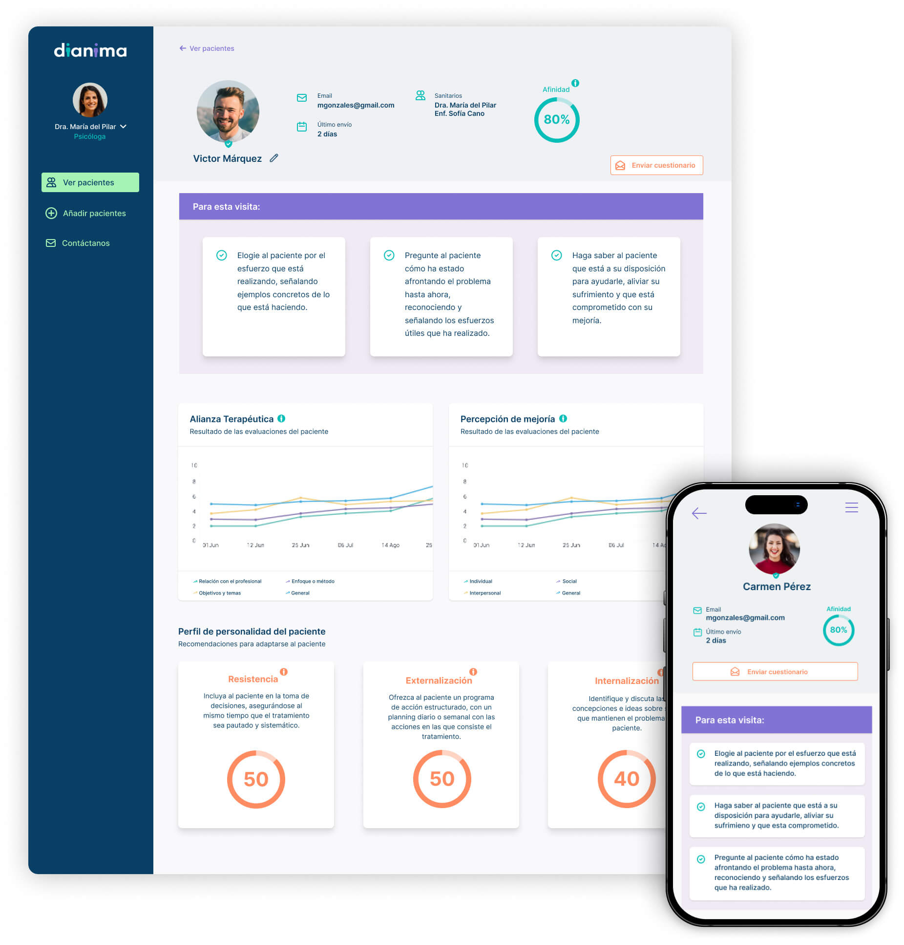
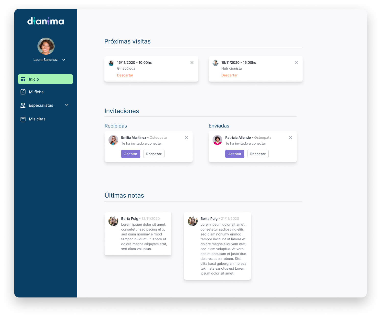
Working at Bitesize, I was fortunate enough to be a part of an amazing project where I played a key role in various stages. We began by conducting in-depth quantitative and qualitative research, and I was involved in the Define, Ideate, and Prototype stages aswell. I collaborated with a graphic designer to create wireframes and took charge of prototyping until we reached the final design (which is still in development).
My Role
UI/UX Designer
Collaboration
1 Manager
1 Graphic designer
Research Team
Platforms
Miro
Figma
Airtable
Project needs
From the start of the project, we had a lot of ground to cover:
- Verify assumptions about the main idea
- Research potential competitors
- Develop the brand
- Create initial prototypes
- Test with different types of users
Solution
Like any other project, we began by conducting research on various topics to gain a deeper understanding before defining our strategy.
- Verifying assumptions about the main idea through quantitative and qualitative research
- Researching potential competitors (benchmarking)
Once we had a clear goal in mind, we got to work creating personas, mapping out user journeys, creating user flows and prototypes before conducting testing with various user types, such as physicians and patients. Additionally, prior to prototyping, we had to establish the brand by selecting a color scheme and finalizing the logo.

User personas (patients)
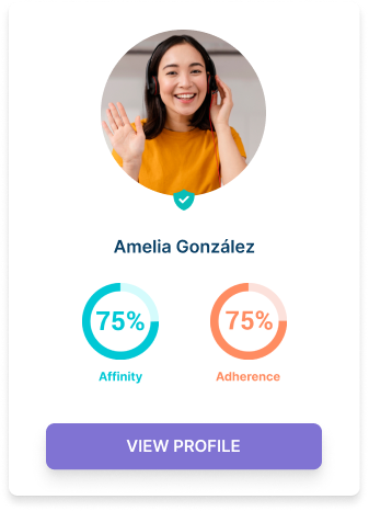
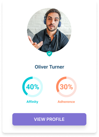
In this project, user personas can be grouped into two categories: physicians and patients. Here you can see two examples of patient user personas.
Amelia González
Amelia is an easy-going and trusting patient. Amelia has Type 2 Diabetes, but she has her condition under control. She takes medication, checks herself regularly, is open to medications, and is appreciative to have a wonderful Medical Provider.
Oliver Turner
Oliver also has Type 2 Diabetes. He is more skeptical and does not trust most medications. He often misses his appts and blood labs. His last labs showed high cholesterol and borderline high blood sugar (triglycerides)
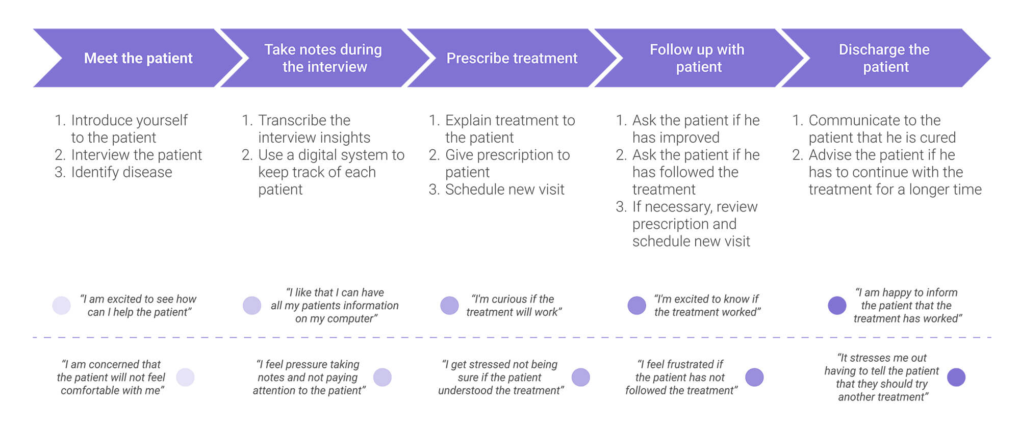
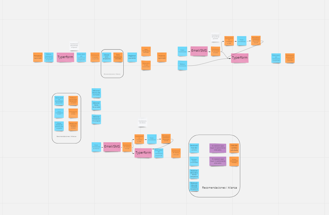
User journey (physician)
Prototypes
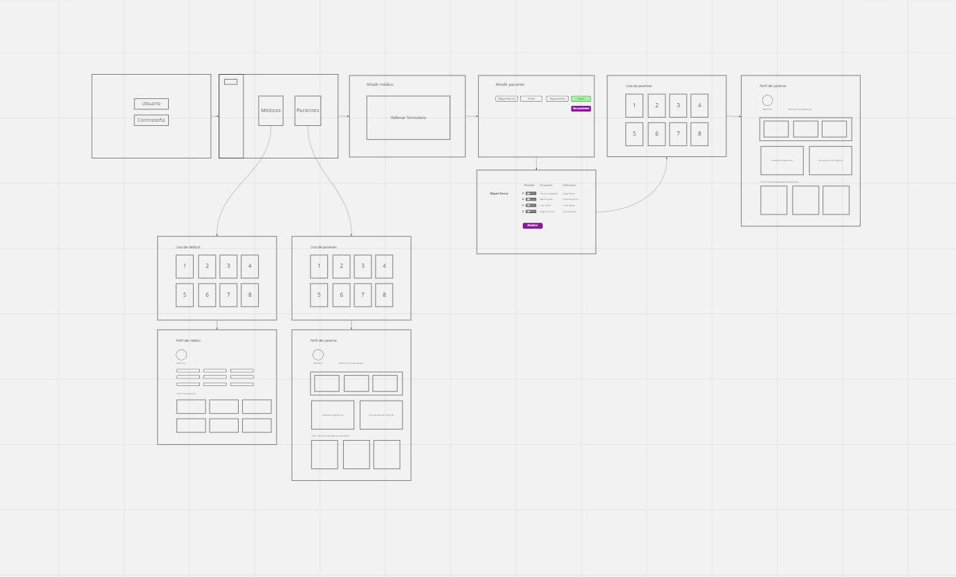
I started by sketching out rough ideas and concepts on Miro. I then used Figma to turn the wireframes into interactive lo-fi prototypes, which allowed us to start testing the design with the rest of the team and gather feedback. Through this process, I was able to iterate on the design and create a more refined, high-fidelity prototype.
First sketches
User flow
We needed to create different user flows for both physicians and patients. In the example below, you can see different ways physicians can use to contact their patients.
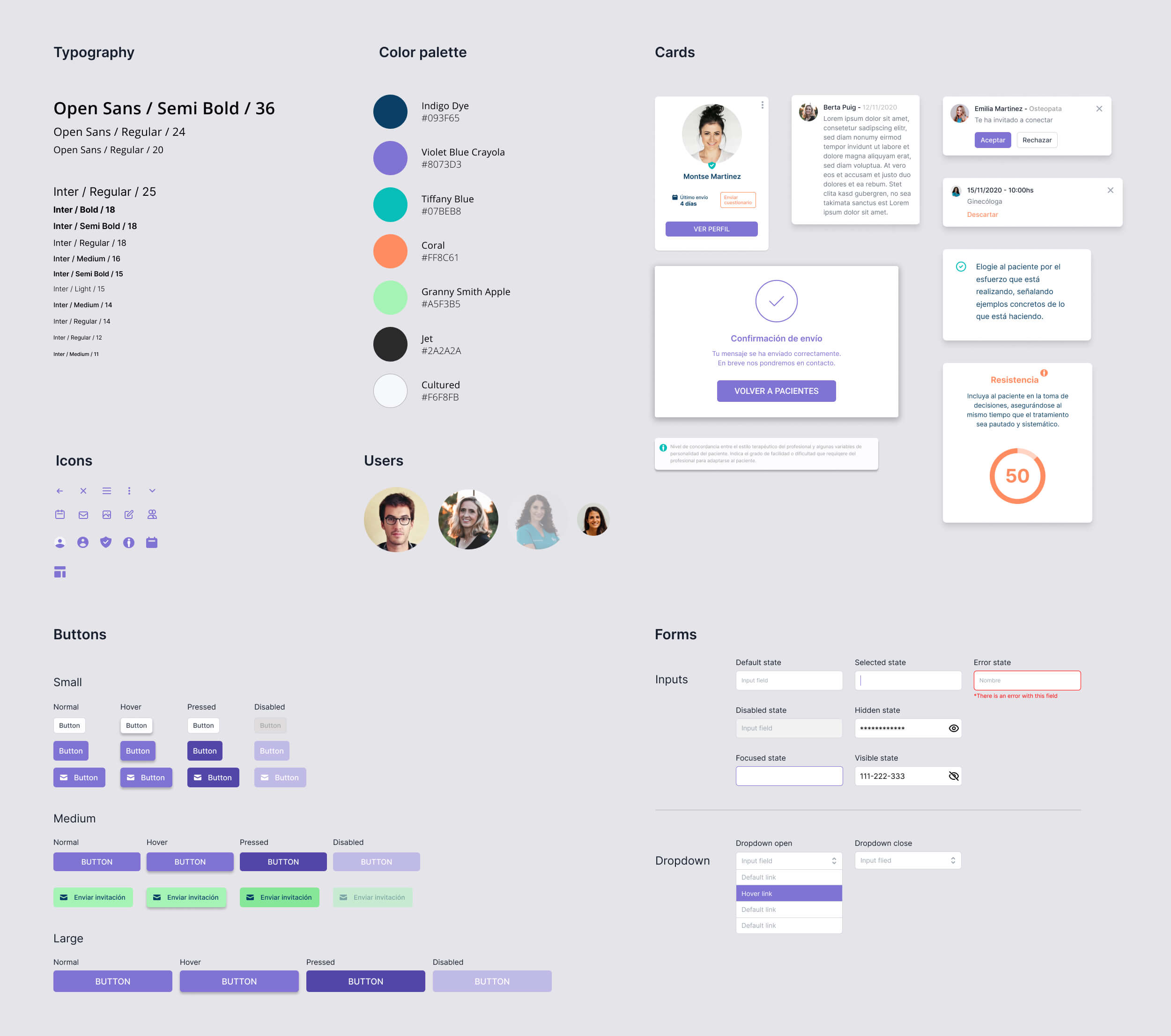
UI kit
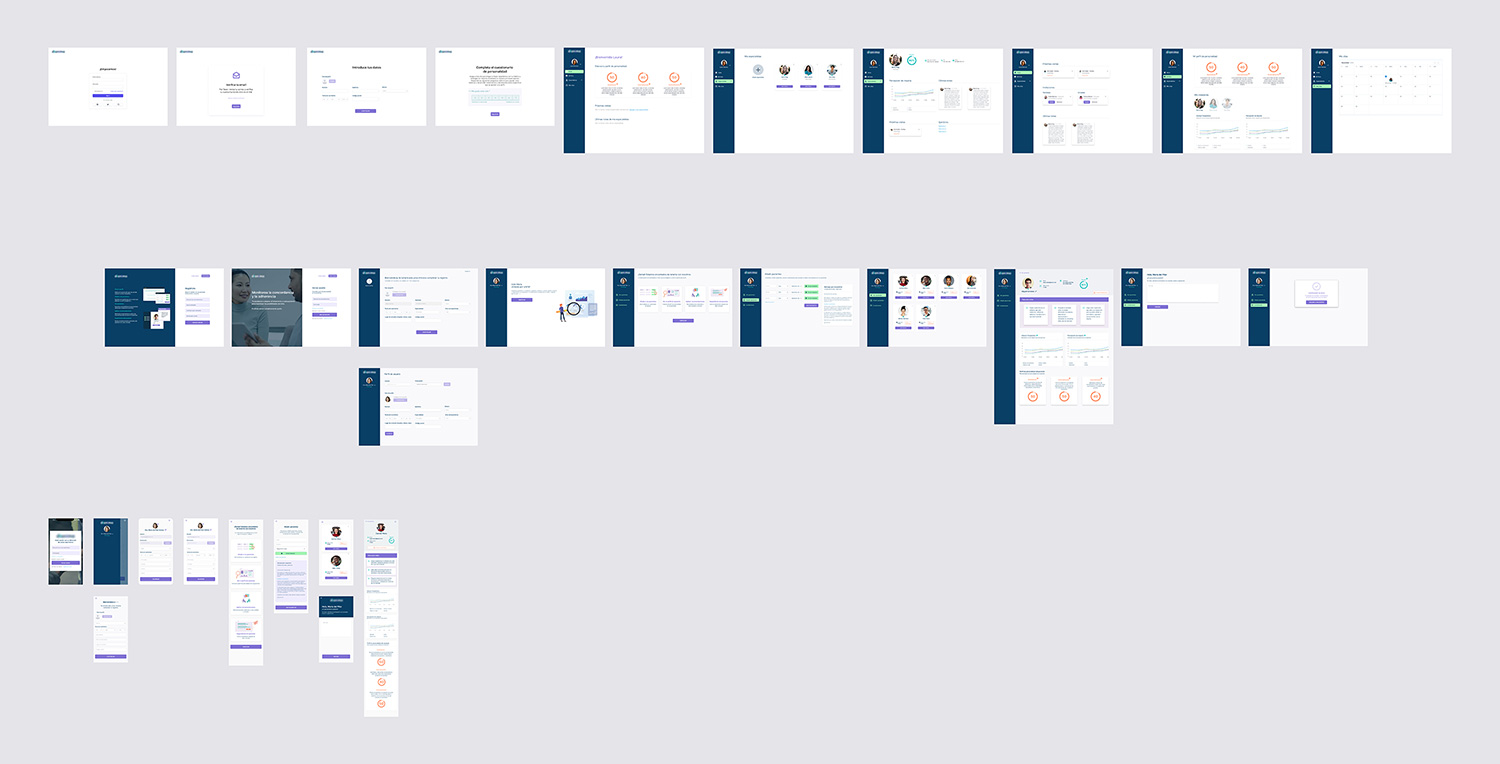
Mockups
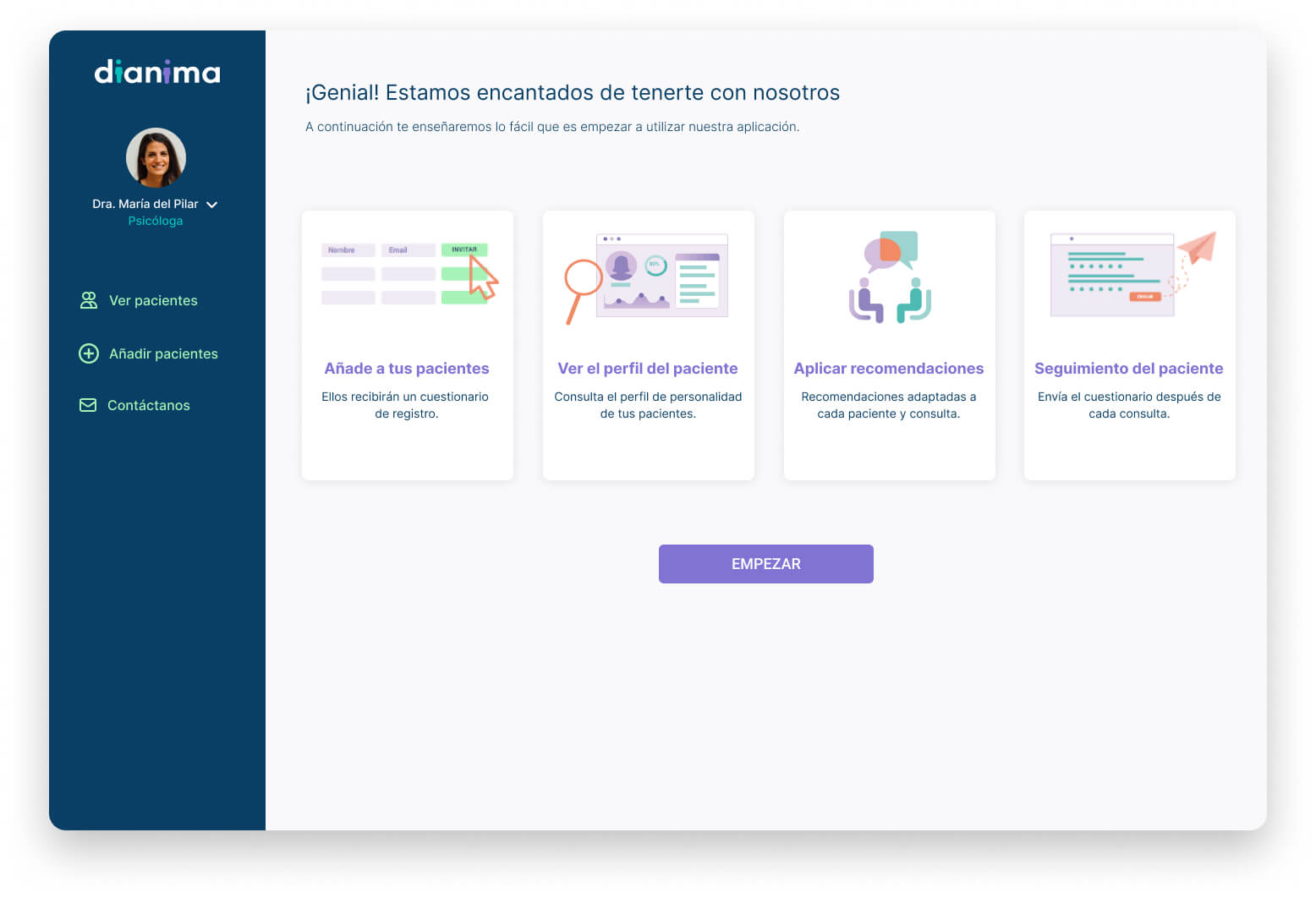
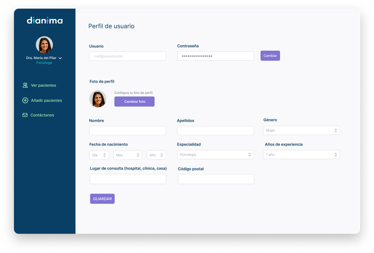
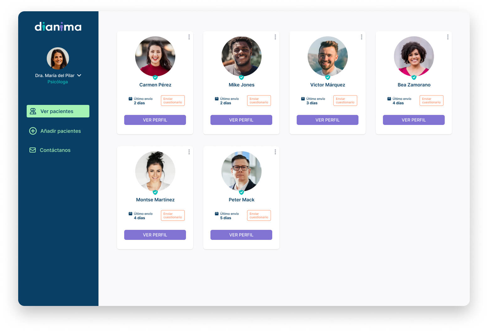
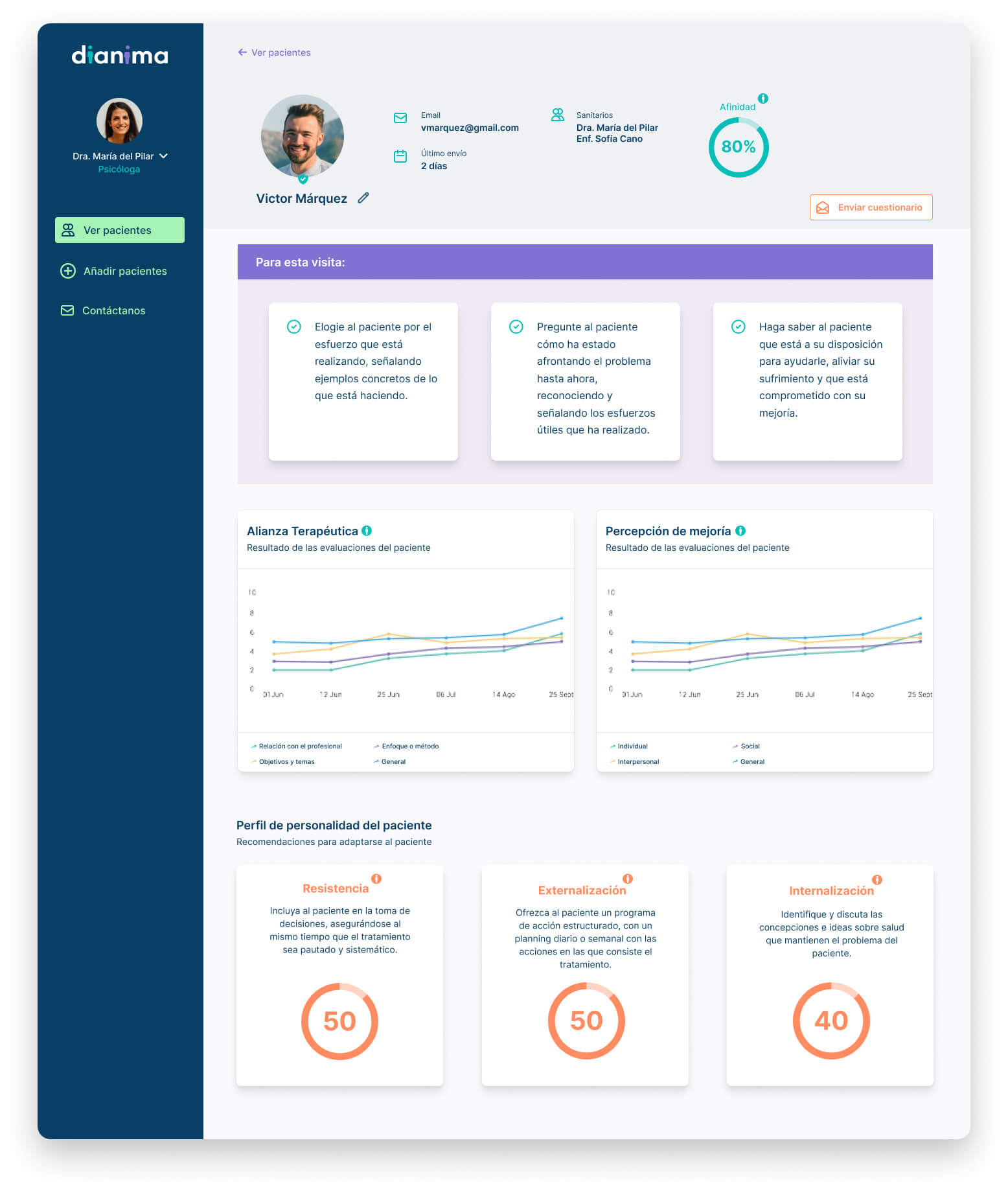
Hi-fi prototypes
What I learned
The most important thing I learned in this project is how to identify the key words to perform the searches we needed. As the project was about a topic that I was not familiar with (and with very specific terminology), I had to do a lot of research to find the right terms to find the information we were looking for.
Even after the Define stage, the project had a couple of significant pivots and it was very interesting to see how we found new features and possibilities that we hadn’t seen at the beginning.

I have more than a decade of experience as a digital designer. Through the years, I've honed my skills and continuously strive to improve, bringing my best to every project.
