Gifts App
UI/UX Design
Overview
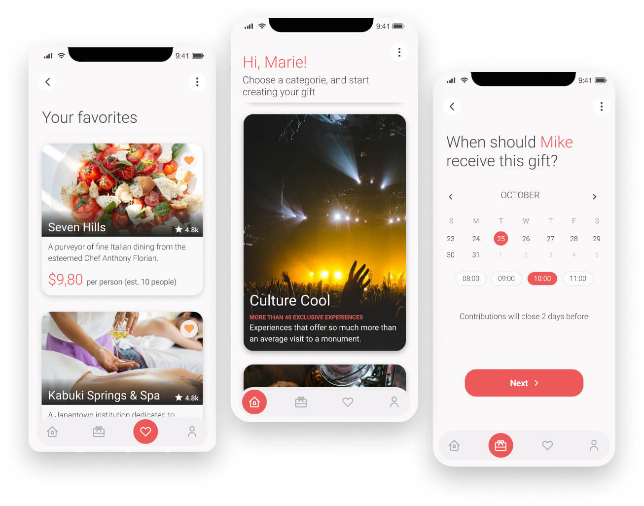
The objective of this project was to streamline the gifting process, both for personal and group gifts, while also providing the opportunity to give unique experiences.
Through extensive research, we found that many gift-giving apps offer a plethora of options, which can be overwhelming.
Unfortunately, the project is currently on hold, so some key details and features are in stealth mode. However, the work we’ve done, from research to advanced prototypes, is highlighted here for your reference.
My Role
UX/UI Designer
Platforms
Miro
Figma
Airtable
Problem
Group gift-giving can be a complicated process, particularly when it comes to agreeing on the perfect gift and collecting the funds to purchase it. We realized that the person who organizes and takes charge often (if not always) has to chase down one or several individuals to pay their share and provide their input on what to gift. This can be incredibly frustrating and cause reluctance among those involved to take responsibility.
Solution
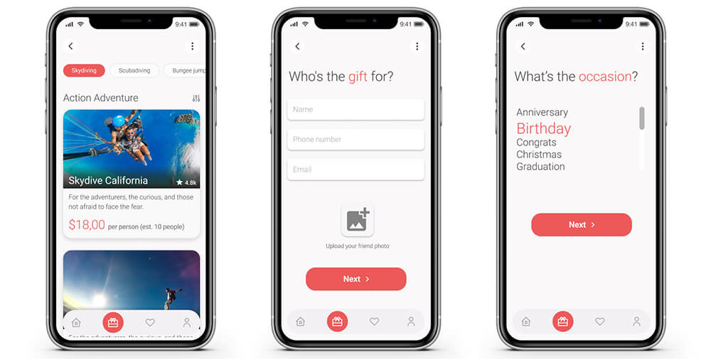
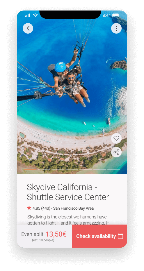
Provide tools for participants to communicate and collaborate on the selection of the experience to be gifted, as well as the cost per person. Additionally, the application handles dividing the total cost among the number of participants and manages transactions directly through the app.
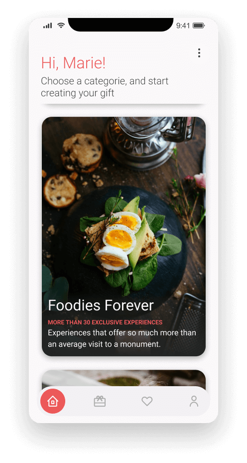
Finally, the app offers a curate a selection of experiences, organized into attractive categories that would be regularly updated.
Research
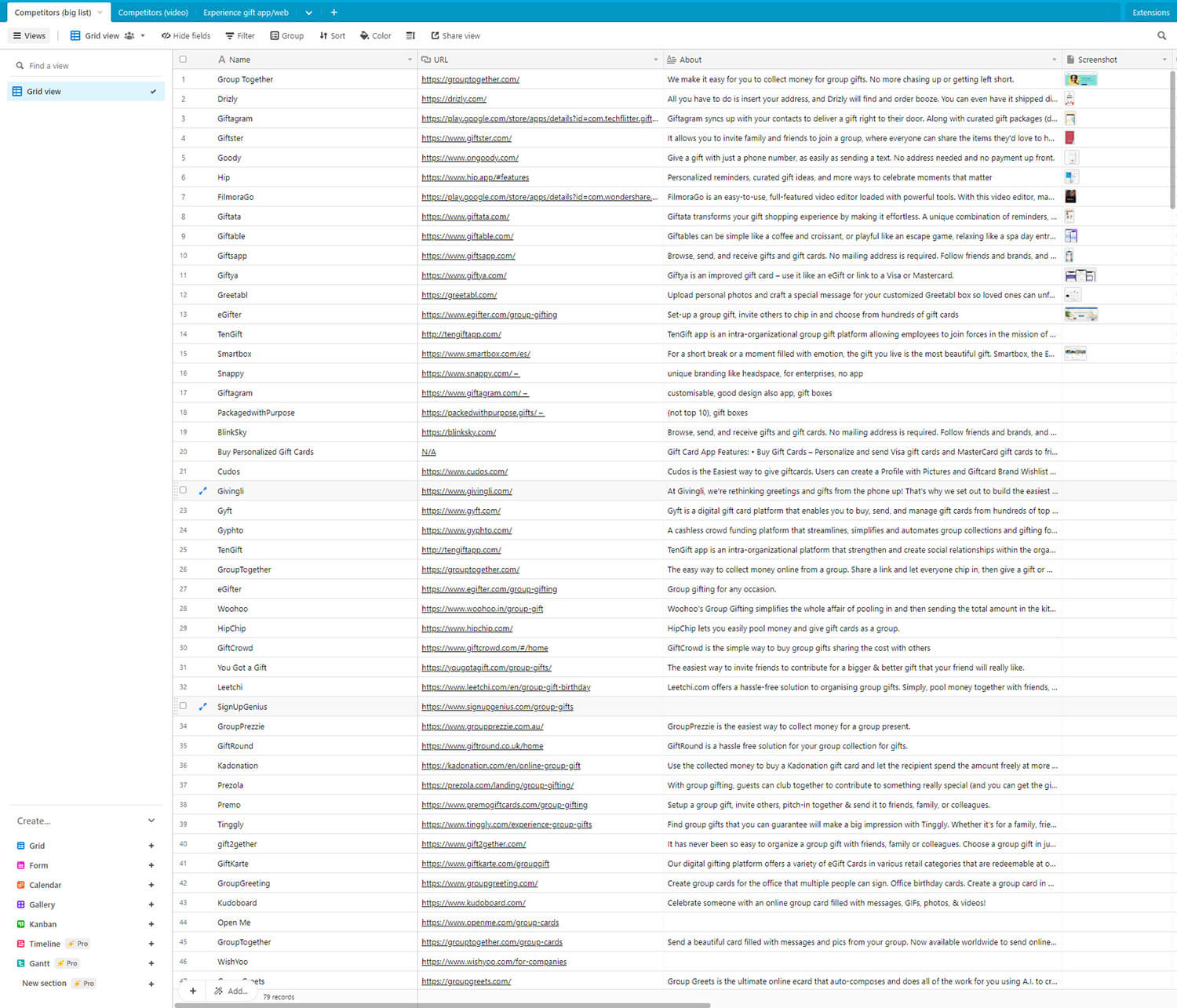
I discovered there are multiple gift apps options on the market so I performed an exhaustive research to find our direct competitors. After the research, I couldn’t find any app or platform that does exactly what we wanted to build.
Prototypes
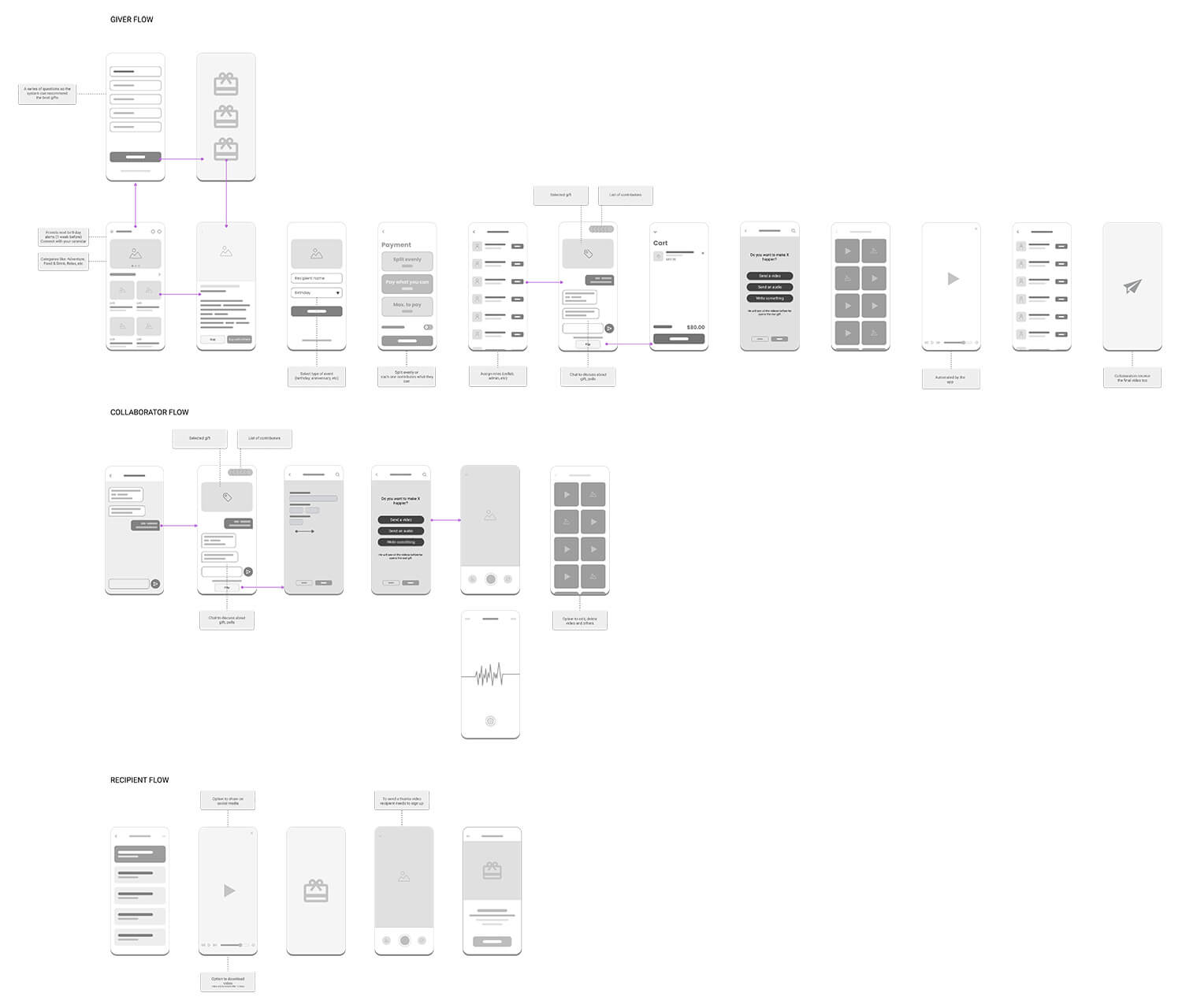
When starting this project, my first step was to create lo-fi prototypes in order to validate the idea and gather feedback from potential users. I used simple tools such as pen and paper, whiteboards, and basic design software. These rough sketches and wireframes were then presented to a small group of test users for feedback. Their input helped me identify areas of improvement and refine the idea.
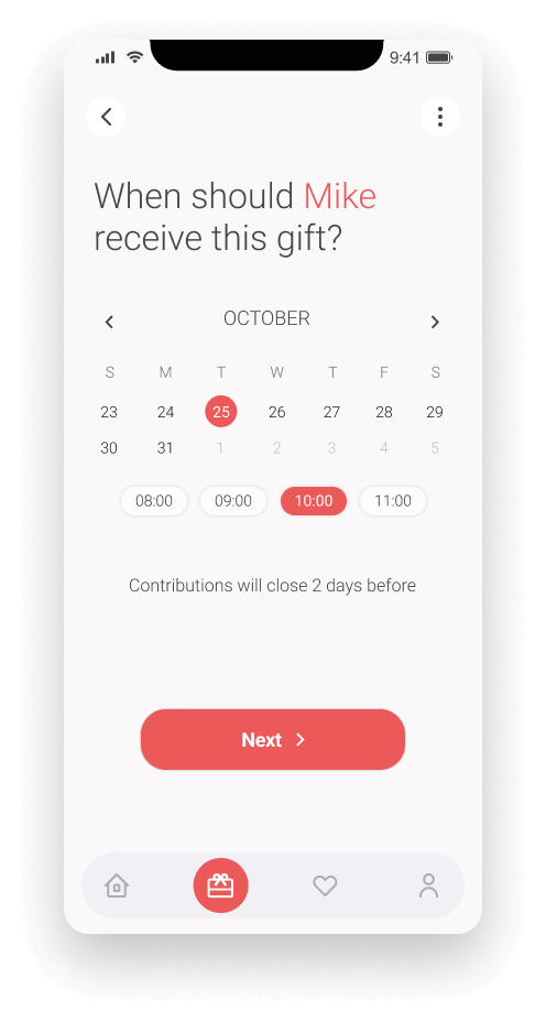
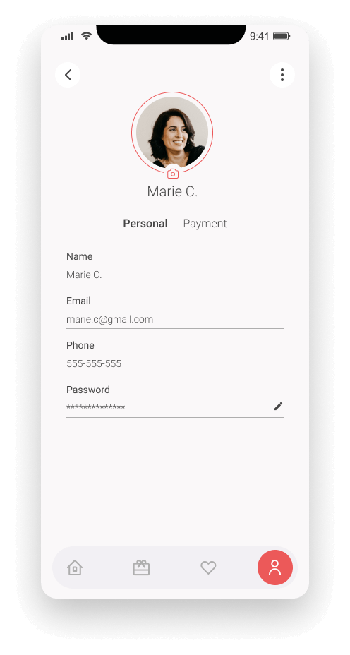
With a better understanding of what users wanted and needed, I then moved on to creating final prototypes. These were more polished and detailed versions of the original concept, which closely resembled the final product.
The process of creating lo-fi prototypes before final prototypes helped me to validate the idea quickly and efficiently, and also provided a clear direction for the development of the final product.
First sketches
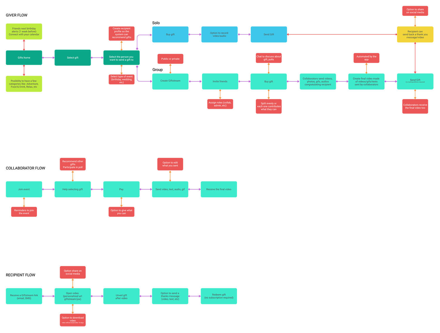
User flow
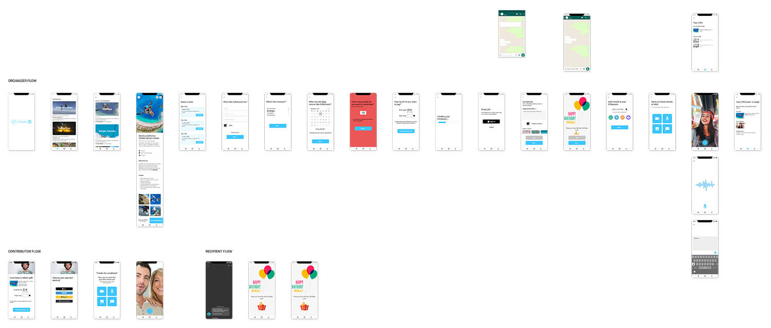
I came up with 3 different user flows, one for the person creating the gift, another for the participants contributing to the gift and a last one recreating what the recipient would see.
First mockups
Hi-fi prototypes
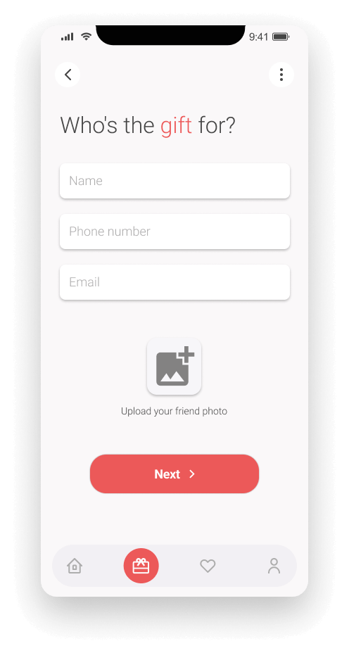
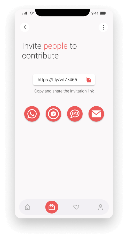
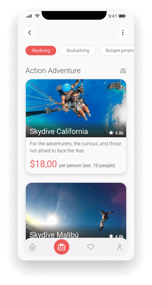
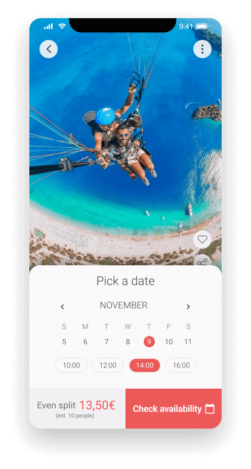
What I learned
Working on a project that solves a problem that many people have was an incredibly valuable experience. Not only did I learn a lot about user flow, design and development, but I also got to see first-hand the impact that a well-designed solution can have on people’s lives. I can confidently say that I would use this tool myself and I know many others would find it helpful as well.
One of the most important lessons I learned during this project was the importance of putting yourself in all possible user situations. In this case, the gifter, the collaborators, and the recipients. By understanding the needs and pain points of each user group, I was able to design a solution that addresses the specific needs of each one and make sure it was easy for them to use. This helped me to see the bigger picture, and design a user-centric solution that benefits all parties involved.

I have more than a decade of experience as a digital designer. Through the years, I've honed my skills and continuously strive to improve, bringing my best to every project.
